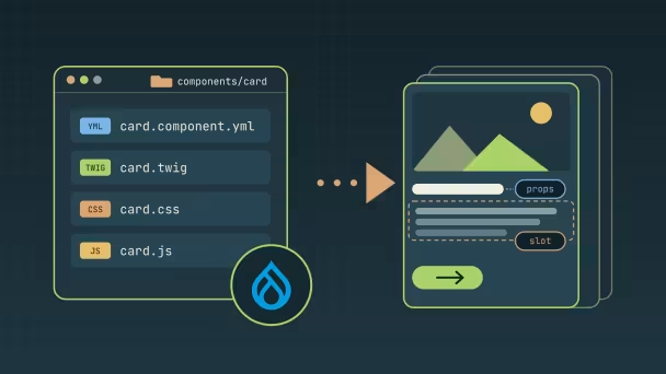
Single Directory Components: the building block of modern Drupal theming
What Single Directory Components (SDC) are, how a component is organised, the difference between props and slots, and how to use them from Twig, render arrays and page builders.

For years, a Drupal "component" was spread across a theme: a Twig template in templates/, its CSS in a library declared in *.libraries.yml, its JavaScript somewhere else, and no description of what data it expected. Single Directory Components (SDC) fix that. Introduced in Drupal 10.1 and part of the core API since 10.3, they are now the foundation of front-end work in Drupal, and of page builders like Canvas.
One component, one folder
A component lives in the components/ folder of a theme or module, with everything it needs in one place:
components/
  card/
    card.component.yml   # metadata and schema (required)
    card.twig            # template (required)
    card.css             # loaded automatically when the component renders
    card.js              # same
    README.md            # optional documentation
    thumbnail.png        # optional preview image
There is no library to declare. When the component is rendered, Drupal attaches its CSS and JavaScript automatically, and only on pages that use it.
The metadata file
card.component.yml describes the component and its inputs with JSON Schema:
$schema: https://git.drupalcode.org/project/drupal/-/raw/HEAD/core/assets/schemas/v1/metadata.schema.json
name: Card
status: stable
description: A teaser card with an image, a title and a link.
props:
  type: object
  required: [title]
  properties:
    title:
      type: string
      title: Title
    url:
      type: string
      format: uri-reference
      title: Link
    variant:
      type: string
      enum: [default, highlighted]
slots:
  body:
    title: Body
Two kinds of input:
- Props are typed data: strings, numbers, booleans, enums, URLs, arrays. The schema documents them, and Drupal validates them when assertions are enabled (in development), so a wrong type fails loudly instead of rendering something odd.
- Slots are free markup: any render array or Twig content goes in. Use them for content whose structure the component doesn't control (a body, a list of other components).
The template uses them like any Twig variable:
<article{{ attributes.addClass('card', 'card--' ~ (variant ?? 'default')) }}>
  <h3 class="card__title">
    {% if url %}<a href="{{ url }}">{{ title }}</a>{% else %}{{ title }}{% endif %}
  </h3>
  <div class="card__body">
    {% block body %}{% endblock %}
  </div>
</article>
Using a component
Components are identified as provider:name, for example mytheme:card.
From Twig, without slots, use include:
{{ include('mytheme:card', { title: node.label, url: url }, with_context = false) }}
From Twig, with slots, use embed and fill the blocks:
{% embed 'mytheme:card' with { title: label } only %}
  {% block body %}{{ content.field_summary }}{% endblock %}
{% endembed %}
From PHP, with the component render element:
$build['card'] = [
  '#type' => 'component',
  '#component' => 'mytheme:card',
  '#props' => ['title' => $title, 'url' => $url],
  '#slots' => ['body' => $body_render_array],
];
Because the component owns its markup and assets, a node--teaser.html.twig template shrinks to a single include, mapping fields to props.
Useful details
- Overriding a component. A theme can replace a component provided by a module or base theme with the
replaceskey in its own metadata, keeping the same props and slots. - Status.
statuscan beexperimental,stable,deprecatedorobsolete, which tells other developers (and tools) how much to rely on a component. - Variants. Recent core versions let a component declare named
variantsin its metadata, and the render element accepts#variant. - Hiding from UIs.
noUi: truekeeps internal components out of page builder libraries. - Library tweaks.
libraryOverridesadds dependencies (for examplecore/once) or external assets to the generated library.
Why it matters now
SDC is what lets the rest of the ecosystem work with your theme:
- Drupal Canvas reads component schemas to build the editing form for each prop, and only offers fields whose data matches a prop's type.
- Storybook-style tools and component libraries can document and test components in isolation.
- Contrib themes can ship components that other themes reuse or replace.
Tips for getting started
- Start with small, presentational components (button, card, heading). Leave data fetching to Drupal.
- Keep props simple and typed. Prefer an
enumover a free string for options like a variant or a size. - Use slots for nested content, not for data you could express as a prop.
- Enable assertions locally (
zend.assertions = 1) so schema errors show up during development. - Document each component in its
README.md. Six months later, it's the first file you'll open.
Further reading: the SDC documentation on drupal.org.